(Source: www.logodesignlove.com)
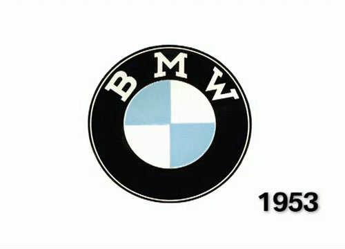
BMW logo evolution

The four-minute video embedded below (email subscribers can view it on-site) talks about the origins of the BMW logo, dispelling the myth that the emblem was created around aircraft propellers.
The following info was transcripted from the video:
—
Aircraft engines are the origin of the myth. People think that the BMW logo is based on a rotating airscrew. The origin of this interpretation is the cover of a BMW aircraft magazine. This picture (shown below) was taken in 1929, years after the logo first came into existence. Respect for the publicity department back then for the fact that the airscrew myth continues today.
1929 BMW aircraft magazine cover illustration (close-up)
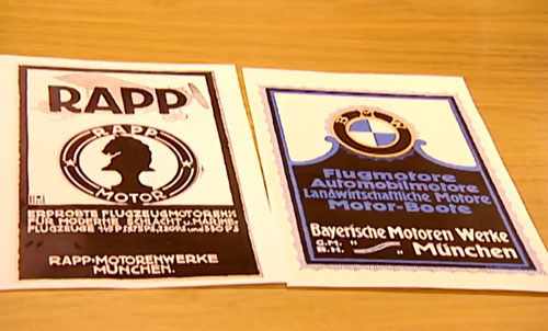
But what’s really behind the origin of the logo? For those who are trying to answer this question unavoidably come across the aircraft engine manufacturer Rapp.
“As Rapp grew into BMW, BMW assumed all the business segments, and the company wanted the logo to be oriented on Rapp’s logo. As you can see here on this example, Rapp has a black horse as a symbol on its logo. BMW chose the Bavarian national colours as a symbol, but arranged the letters exactly like Rapp. So you can see very clearly how the BMW logo was developed.”
— KAI JACOBSEN, AUTOMOBILE HISTORIAN, BMW GROUP

Rapp Motoren Werke logo, Bayerische Motoren Werke logo

Flag of Bavaria, courtesy of Thinkstock


Other logo transitions through the years:
No comments:
Post a Comment